Friday, 8 April 2011

Final Words...

To the examiner,

I hope you enjoyed reading through my blog, looking at how my research and planning tied in with my final product, seeing my progression throughout the blog and the photos I've taken for my magazine. I'm really happy with my magazine, i couldn't ask for any better photos, as i think the photos i have taken are excellent. I believe my research and planning could of been better, but overall i'm really happy with my magazine. I hope you enjoy the design of my blog too. I have created a header for my blog on Photoshop, which includes all the brands i'm interested in and wear. I have also labeled each individual post so that you can find the posts easy, on the right hand side. Also included on the right hand side is links to my teachers blogs, links to the websites which influenced my magazine, and the websites which helped me upload documents and create presentations for my blog. A lot of students in my class have added a music player to their blog, to show their genre of music. I have gone about with a different way to express the genre of music on my blog. I have used my Animoto presentations to play the genre of music my magazine is aimed at. I believe i have progressed a lot from my preliminary task, with my skills with Photoshop improving dramatically and my creativity. I'm really happy with my magazine and I have put a lot of effort into my blog, but i'm disappointed with my Research and Planning as i'm missing a few posts. However, i'm really happy with how everything else went and i hope you enjoyed reading my blog as i enjoyed making it.

Thank you for marking my blog, i hope you enjoy it!

Josh Willis

Thursday, 7 April 2011

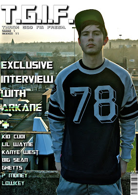
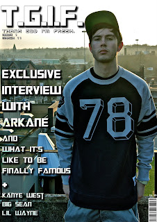
Cover Page

Contents Page

Double Page Spread

Question 1 - In What Ways Does Your Media Product Use, Develop Or Challenge Forms And Conventions of Real Media Products?

Question 2 - How Does Your Media Product Represent Particular Social Groups?


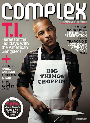
I have chosen the Complex magazine featuring T.I. to compare to my main cover image. Both magazines are both appeal to the same social group apart from the fact complex appeals to 20 – 40 year olds, while mine appeals to a younger audience. The reason why I chose this image was because they both have the same pose, not looking exactly into the camera, but to the side a bit more. Both poses show attitude and power, as my model has his hands behind his pockets, standing up tall, while T.I has knives in his hands, standing tall, but still having the same posture. While T.I. is much older than my model, it would still appeal to my audience because of his music and the fact both magazines are the same genre. My model also appeals a lot to my audience because of the young age and that the model is not old / the same age as my audience and the way he is dressed, the background of the image of my magazine also fits in with his clothing and music.

Question 3 - What Kind Of Media Institution Might Distribute Your Media Product And Why?

I believe using Complex Media Network to distribute my magazine would be best as it is the distributor of Complex magazine, and that is the closest magazine to mine and where my inspiration came from. I would want them to publish my magazine as they already publish a massive magazine which is just the same, so they would know who to distribute the magazine too, and to have a big institution behind you like Complex Media Network will also show that my magazine is good. Their advertising skills and techniques will be valuable and they would advertise my magazine is all ways possible (Such as advertisements on the internet and posters in their magazines) to gain as much attraction to my magazine as possible.
The reasons why Complex Media Network would want to distribute my magazine and advertise is it, is because they already have a familiar magazine, but I aim for a younger audience, so they already know how to sell it, they would also have good contacts to get into in to big newspaper stores, and with their reputation it would get my magazine a lot of hype and interest. My magazine is also different to other magazines, with the layouts, fonts and genre used.

Question 4 - Who Would Be The Audience For Your Media Product?


My original audience profile posted in my Research and Planning seaction still applies to the audience who would buy my magazine. My typical audience member who would be interested / buy my magazine would be a male, who goes to college / university, who takes care of his appearance and is interested in fashion. Listens to Grime/Rap and wants to know more about the background to uk grime / rap. They are inspired by artists such as Kanye West, Kid Cudi, Wiley and B.I.G Sean. The audience member would also be a sneakerhead who takes care of his sneakers / collects sneakers for deadstock.

My magazine appeals to this type of audience as it collaborates music and clothing together, which uk grime and rappers are associated with. So my magazine offers the aspect of uk grime and rap, while including the freshest clothing out for the underground scene. The way the audience knows that it contains both of these aspects is from the cover page, is that the cover talks about rappers and the main image is a photo of a stereotypical uk rapper wearing streetclothing. I believe my audience profile describes the audience my magazine is targeted to.

Question 5 - How Did You Attract/Address Your Audience?

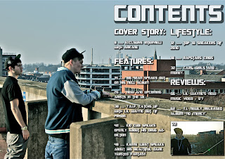
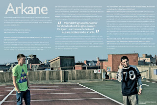
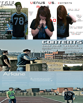
The target audience for my magazine was males, ages 16 - 24. My magazine is also aimed at males who are interested in the uk rap genre and into streetclothing. My model on the front cover portrays a normal uk grime rapper, which my audience can relate to and understand that it's that type of genre. The text on the front cover is eye catching and would standout to customers when browsing magazines. Here are 3 people that reviewed my magazine and what they thought of it. Pat: What I like about Josh’s front cover, is his layout of where he has positioned everything, with the main cover lines and cover lines wrapped around the main image and the masthead being bold and eye catching to the audience. I also like his contents page, how he’s made into a double page content, with the picture left blank on the left page, and the text of the contents on the right. The double page spread is a really imaginative creative idea which he has produced. I really like how he’s got his article at the top of page while having the main image below the article, this works really well. I also think the photos which he has taken are excellent and represent his genre. If I saw this on the self, I would be very interested in buying.
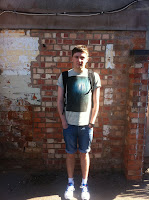

Rachel: I really like the front cover of Josh’s magazine as it looks professional and the photography is excellent. The font is really clear and looks good against the photo, as they both contrast. The contents is also presented really well, as you can still see the main part of the photo, in addition I like how it is the same type of photo to the font cover so they link. The font is again very clear and easy to read, and I think the idea of using a photo to represent a page. The double page spread is very effective, how the two models are on each side of the page, again the writing is not covering the main focus of the picture. Overall I really like Josh’s magazine, and I think it would attract many people, as it looks so professional and the style it is in.
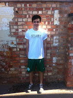

Callum: What I like about Josh’s front cover page is it is the cover lines are placed well and they are easy to read they are placed around the main title thing which is effective because the reader will want to read on. I like the contents because it is spread on one side of the page this shows off the graphological parts in the picture. The contents are easy to read in bold writing of the key featured reviews and stuff in the magazine. The double page spread shows off the intent of the magazine with its urban background it has a review of Arkane which is a group one is a producer and the other one is an MC it is set out nicely getting the point across but the font could be increased to make reading it easier. Overall I think the magazine is good and get its points across easily with good pictures showing what the style is and what it is about.
Question 6 - What Have You Learnt About Technologies From The Process Of Constructing This Product?


Here is all the equipment and programs that I have used throughout the project. Here I have listed each 1 of them and explained what use they had and what they were used for.

Laptop – Acer Aspire 5715Z
My laptop was used throughout the media project, from using it to access and update my blog, using programs such as Adobe Photoshop CS5 and Microsoft Office to help create the magazine, help to write up onto blogger and using the internet for research into my magazine.

MacBook Pro
I used a friend’s MacBook Pro to use a feature which was not accessible on my own laptop (iPhoto).

Camera – Sony Alpha a290
For my final media photos, I used a Sony Alpha a290 camera, the quality of this camera is outstanding and has produced some cracking photos for my magazine.

Integral 2GB Memory Stick
I used a memory stick to help me move files from my laptop to the school computers or vice versa. I also used my memory stick as a backup of all my work in case there was any problems with my laptop.

iPhone 4
I used my iPhone as a storage device, camera (photos of equipment) and to write down notes. I also used helpful applications, such as Google Maps to help me find the destination of where I wanted to take my final photos and to use safari when my laptop was not accessible.

Adobe Photoshop CS5
Adobe Photoshop CS5 was the main program I used, to create my magazine. Photoshop helped me to edit photos, add effects to images and text, and helpful tools, such as the magic wand tool.

Microsoft Office Word 2010
Microsoft Office Word was the program I used mostly for my research and planning. It allowed me to write down notes of my ideas I had, to write down information and to do my research and planning tasks, which were later then either copy and pasted onto my blog or uploaded to Scribd and embedded onto my blog.

Microsoft Office Publisher 2010
Microsoft Office Publisher was used to help me create the templates of my magazine for my research and planning.

Microsoft Office PowerPoint 2010
Microsoft Office PowerPoint was used to help present information onto slides for my evaluation.

iPhoto
I used the program iPhoto to help me edit the final photos by adding effects and to change the contrasts of the images.

Paint
I used the program Paint to help me convert images from bitmap or GIF into a JPEG format.

Animoto
Animoto was my substitute for PowerPoint, as I felt it was much better to present my ideas in a creative way. Animoto was used for my Research and Planning, displaying my test shots and final shots, as well as my evaluation.

Google Chrome
I used Google Chrome so that I could access websites, such as Scribd, Animoto, Facebook, Google, Blogger etc.

Scribd
Scribd was used so I could upload Word Documents and embedding them on my blog.

Google
Google was used to help me research information for my magazine and to help find images.

Facebook
I uploaded my final photos on Facebook to see what people thought off the photos that I took and my magazine ideas. From this I got constructive criticism to help improve my magazine and what photos would suite best for my magazine.

Question 7- Looking Back At Your Preliminary Task, What Do You Feel You Have Learnt In The Progression From It To Full Product?


Looking back at my preliminary task, I believe that my final magazine has shown the progression I have made throughout the project. With my preliminary magazine, you can see that my front cover and contents page is very boring and dull, this shows a lack of inspiration and skills with Photoshop, and that my preliminary magazine does not look like an appealing magazine. When first creating my preliminary task magazine, I had no idea how to use Photoshop, so my knowledge and skills were very little with the program. The colour scheme used for my preliminary magazine (black/blue/red) was also very boring and only the red was the attracting colour. After creating my preliminary magazine, I knew there was a lot of work I had to do and improvement, for my music magazine. So I began to start experimenting with Photoshop and learnt how to crop out better, adding effects to text and images, and how to use layers effectively (duplicating text with drop shadow will give it more depth). After creating my draft magazine, I felt it looked more like a magazine, and that my Photoshop skills and creativity skills have improved, but I needed more of a variety of photos, I also did not like how my DPS layout looked either. For my final magazine, I looked through my research & planning, and thought more about the settings off where I could take my photos. When taking the final photos, I took into consideration how I could base my layout on the image, as I did not want to have a white background with cut out pictures on it. So I allowed space around the images, using my imagination of what the photo would be suited for (Front Cover / Contents / Double Page Spread).

After creating my final magazine, I believe my progress from my preliminary task magazine to my final magazine, has been a massive step-up. I believe my skills and understanding of Photoshop has improved remarkably and my creativity has also improved. I believe my magazine is perfect, the images which I took are brilliant in terms of quality, and that my layout is perfect. After all the improvements from my preliminary task, I believe my final magazine looks like a professional magazine such as Complex (same genre of magazine) and that i have also improved with my editing skills on Photoshop and iPhoto.

Final Magazine Photos


Here are my final photos which i have picked out of the 270 which i took. I thought these photos which i picked out, were the best ones, and would be best suited for my magazine. All of the images have been edited on iPhoto.