Sunday, 27 February 2011

Producing The Front Cover


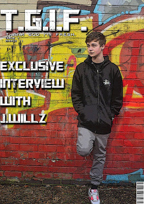
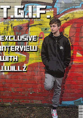
Here are screenshots of me producing the front cover, here you can see i have a basic idea of what i was creating and have adapted on this. I then started to experiment with text around the main image and placement of text. This is what i plan to do with my final piece of work.

Saturday, 26 February 2011

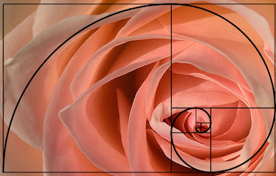
Golden Spiral/Rule Of Thirds


From this webpage, i have found how to position my images so that it improves the quality of the magazine and placement of images. The webpage explains all this and more on how to get the best out of my images and placement of my images. I will take this all in when i take photo's for my final design.

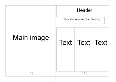
Double Page Spread Mock Up

Here is a rough mock up layout off my double page spread that i have created. I will use this template but i may change the position of the template when creating my draft and final design.

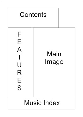
Contents Page Draft

Here is a rough mock up layout off my contents page that i have created. I will use this template but i may change the position of the template when creating my draft and final design.

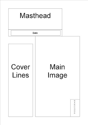
Front Cover Mock Up

Here is a rough mock up layout off my front cover that i have created. I will use this template but i may change the position of the template when creating my draft and final design.

Evaluating Test Shots.

Before taking my test shots, i was behind with work and could not use the particular person i wanted for my test shots, so i then went to a female friend of mine to help me do the test shots and that i would dress her in my clothes. After getting to the destination of the photo shoot and taking photo's off jess. I thought that it would be better for a male to be used, so i had to use myself and used a tri-pod and self-timer on my camera to capture images off myself. I did this because my magazine is aimed at male's and not female's, even though it's just test shots. It did have an advantage of using myself though, as i could use my imagination to take the pictures, but it would of been better if it was someone else posing and me doing the camera work, instead of both. After taking the photos, i found which photos worked well and which didn't, which i will use full advantage of when taking the main pictures. After selecting the test photos which i would like to use for my draft magazine, i will start to edit them on Photoshop, so that they look the way i want them to be. It's hard to show that it's a rap magazine through pictures, as rappers do not hold a microphone in their hand 24/7, but the backdrop indicate this as it's a graphite wall and the clothing which is worn (streetware). To show that it's a rap magazine, i will show it through the text that i will be using.

Test Shots.

Test Shots 8

Test Shots.

Test Shots 7

Test Shots.

Test Shots 6

Test Shots.

Test Shots 5

Test Shots.

Test Shots 4

Test Shots.

Test Shots 3

Test Shots.

Test Shots 2

Test Shots.

Test Shots 1

Colour Palette


After researching colour palettes, i have selected this 4 colour palette. The reason why i have chosen these colours is because i have already found the destinaton of where i want to my images. It's a graffiti containing these strong colours. I will dress my model in black and white containing a little red or yellow. I want the background to stand out while directing the audiences attention to the model.

Researching Fonts


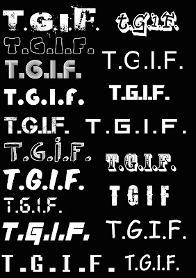
Here i have searched a variety of fonts for my title using the website http://www.dafont.com/. I had an open mind when collecting and researching fonts as seen in the picture. At first i wanted a font which was cartoony / comical as they are different to formal titles as most people use, and that i liked the complex x KAWS magazine Covers. When creating a basic idea of a front cover, i found that the comic font's did not work well and had to search elsewhere.
When testing other fonts, i came across this one called 'Transformers' on http://www.dafont.com/. I liked this font at the start but did not think it would work on my front cover. After testing it, it worked perfectly so that it attracts the audience's attention but still allows the main image to be dominant.

Magazine Name


Thank God I'm Fresh. (T.G.I.F.)

For my magazine, i researched a lot of magazine names which are in the same category as mine and found out that their name's are related to what will be in the magazine and their audience. So for my magazine name, i wanted it to relate to rap and clothing. I believe my magazine name is relevant as my target of audience will understand the term "fresh" in my magazine, which indicates its two things. The word "fresh" is used by a lot of rappers, so this ties in with the rapping aspect of my magazine, and "fresh" also means describing your appearance in clothing. So i believe the word "fresh" sums up what my magazine is about and that it will relate to the audience. The magazine also has a eye catching name as it stands out compared to other magazines, especially in it's initials. It is also catchy phrase for the audience to say, and that it appeals / describes themselves.

Monday, 7 February 2011

Evaluating Feedback


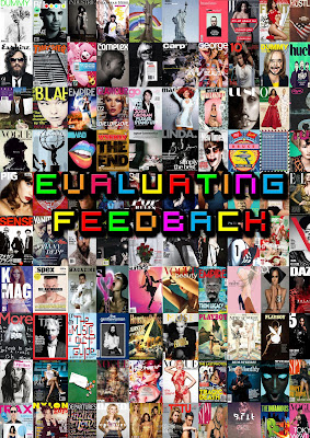
As a class, we had to pitch our magazine ideas infront of each other and comment on which aspects we like / dislike. From this i found out what people thought to my ideas and to see what needs changing. A lot of people have liked the idea of fashion and music going together in a magazine and the audience that i am aiming it at, as they belive streetware is aimied at 16 - 24 age range. I'm deciding to stick to a male group of audience as balacing the 2 can go very wrong. The class have also liked that i'm going for a simple format with eyecatching graphics. This will be different to a lot of people's as they are not adding photoshop skills to their work. The feedback i got was positive and overall i'm happy with my magazine ideas.

25 Word Pitch

Friday, 4 February 2011

Influences For My Magazine

My inspiration has come from various cultures and magazines, but only a few have really inspired me for my magazine. The magazines that have influenced mine are esquire and complex. The reasons why they both have influcned my magazine are because of the variety of mid-shots and long-shots that they use on their front covers. This has influenced my front cover to contain a mid-shot / long-shot for the front of my cover. Complex have also gave me a lot of inspiration, as this is what my magazine is based on (Fashion and Hip-Hop influences). And that fact that they use photoshop skills to create effects to their front cover. Esquire have mainly influenced me with the mid shots - long shots while i prefer the complex layout and creativity. Here is some front covers which have influenced my magazine cover.
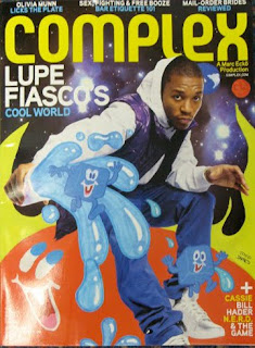


For this magazine, i like how the use of Photoshop is used to create the effects. This is what i'm looking at doing for my front cover of my magazine as it is more eye catching to the audience. I also like how sketches of cartoons are added to the magazine. I may take this and create my own cartoons and scan them onto Photoshop and edit them for my magazine.
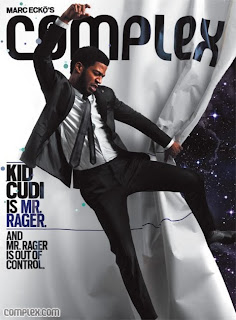
With this magazine from Complex, i like how minimal the cover lines are but still effective and let the customer want to buy the magazine to read more. I aim to do this with my magazine.

With this magazine, i like how they used a mid-shot for the photo. This will influence me to take a mid-shot photo for my magazine front cover, like this one.
Moodboard

Analysing Double Page Spreads

Analysing Contents Pages