 To the examiner,
Josh Willis
 To the examiner,
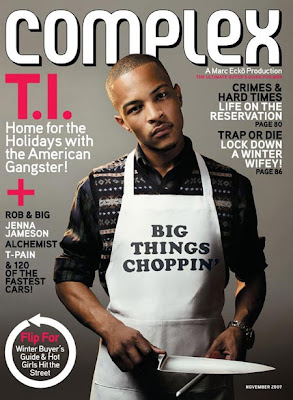
 I believe using Complex Media Network to distribute my magazine would be best as it is the distributor of Complex magazine, and that is the closest magazine to mine and where my inspiration came from. I would want them to publish my magazine as they already publish a massive magazine which is just the same, so they would know who to distribute the magazine too, and to have a big institution behind you like Complex Media Network will also show that my magazine is good. Their advertising skills and techniques will be valuable and they would advertise my magazine is all ways possible (Such as advertisements on the internet and posters in their magazines) to gain as much attraction to my magazine as possible.
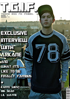
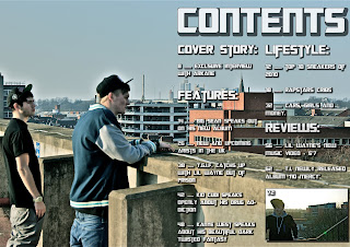
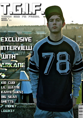
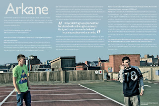 The target audience for my magazine was males, ages 16 - 24. My magazine is also aimed at males who are interested in the uk rap genre and into streetclothing. My model on the front cover portrays a normal uk grime rapper, which my audience can relate to and understand that it's that type of genre. The text on the front cover is eye catching and would standout to customers when browsing magazines. Here are 3 people that reviewed my magazine and what they thought of it.
 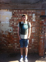 Pat: What I like about Josh’s front cover, is his layout of where he has positioned everything, with the main cover lines and cover lines wrapped around the main image and the masthead being bold and eye catching to the audience. I also like his contents page, how he’s made into a double page content, with the picture left blank on the left page, and the text of the contents on the right. The double page spread is a really imaginative creative idea which he has produced. I really like how he’s got his article at the top of page while having the main image below the article, this works really well. I also think the photos which he has taken are excellent and represent his genre. If I saw this on the self, I would be very interested in buying.
Rachel: I really like the front cover of Josh’s magazine as it looks professional and the photography is excellent. The font is really clear and looks good against the photo, as they both contrast. The contents is also presented really well, as you can still see the main part of the photo, in addition I like how it is the same type of photo to the font cover so they link. The font is again very clear and easy to read, and I think the idea of using a photo to represent a page. The double page spread is very effective, how the two models are on each side of the page, again the writing is not covering the main focus of the picture. Overall I really like Josh’s magazine, and I think it would attract many people, as it looks so professional and the style it is in.
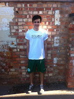 Callum: What I like about Josh’s front cover page is it is the cover lines are placed well and they are easy to read they are placed around the main title thing which is effective because the reader will want to read on. I like the contents because it is spread on one side of the page this shows off the graphological parts in the picture. The contents are easy to read in bold writing of the key featured reviews and stuff in the magazine. The double page spread shows off the intent of the magazine with its urban background it has a review of Arkane which is a group one is a producer and the other one is an MC it is set out nicely getting the point across but the font could be increased to make reading it easier. Overall I think the magazine is good and get its points across easily with good pictures showing what the style is and what it is about.
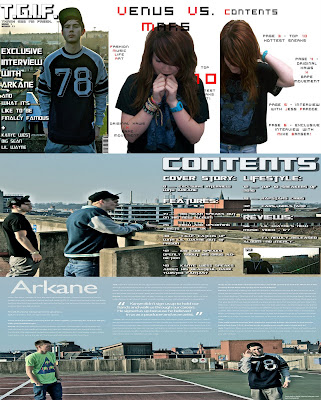

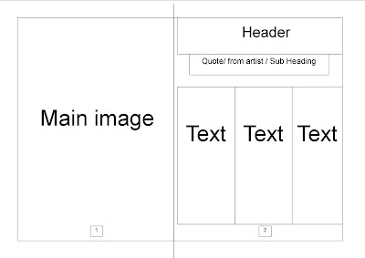 Here is a rough mock up layout off my double page spread that i have created. I will use this template but i may change the position of the template when creating my draft and final design.
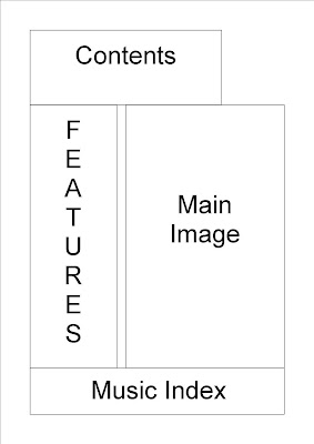 Here is a rough mock up layout off my contents page that i have created. I will use this template but i may change the position of the template when creating my draft and final design.
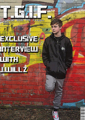
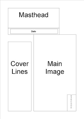 Here is a rough mock up layout off my front cover that i have created. I will use this template but i may change the position of the template when creating my draft and final design.
 Before taking my test shots, i was behind with work and could not use the particular person i wanted for my test shots, so i then went to a female friend of mine to help me do the test shots and that i would dress her in my clothes. After getting to the destination of the photo shoot and taking photo's off jess. I thought that it would be better for a male to be used, so i had to use myself and used a tri-pod and self-timer on my camera to capture images off myself. I did this because my magazine is aimed at male's and not female's, even though it's just test shots. It did have an advantage of using myself though, as i could use my imagination to take the pictures, but it would of been better if it was someone else posing and me doing the camera work, instead of both. After taking the photos, i found which photos worked well and which didn't, which i will use full advantage of when taking the main pictures. After selecting the test photos which i would like to use for my draft magazine, i will start to edit them on Photoshop, so that they look the way i want them to be. It's hard to show that it's a rap magazine through pictures, as rappers do not hold a microphone in their hand 24/7, but the backdrop indicate this as it's a graphite wall and the clothing which is worn (streetware). To show that it's a rap magazine, i will show it through the text that i will be using.

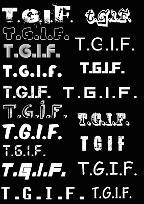
 When testing other fonts, i came across this one called 'Transformers' on http://www.dafont.com/. I liked this font at the start but did not think it would work on my front cover. After testing it, it worked perfectly so that it attracts the audience's attention but still allows the main image to be dominant.
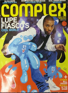 For this magazine, i like how the use of Photoshop is used to create the effects. This is what i'm looking at doing for my front cover of my magazine as it is more eye catching to the audience. I also like how sketches of cartoons are added to the magazine. I may take this and create my own cartoons and scan them onto Photoshop and edit them for my magazine.
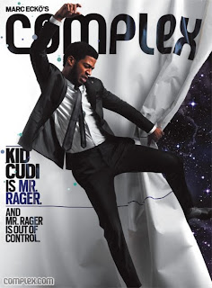 With this magazine from Complex, i like how minimal the cover lines are but still effective and let the customer want to buy the magazine to read more. I aim to do this with my magazine.